
Wedding Colour Palettes for Bangalore Weddings 2026: Trends, Ideas & Expert Tips
Colour is the first decision that shapes everything else — your venue, florals,
wedding attire, lighting and photography. Discover wedding colour
combinations for 2026 and learn how to choose a palette that reflects your style
and complements your venue.
Planning a Wedding in Bangalore?
At Dreamstrokes Wedding Planners, we help couples bring their wedding vision to life through thoughtful planning, creative decor concepts and coordinated styling. From selecting a colour palette to bringing together florals, fabrics, lighting and venue details, we help create celebrations that feel personal and memorable.
Planning your wedding? Talk it through with us.
Tell us about your wedding date, guest count, preferred style and budget. Our team will help you
explore the possibilities for your celebration.
- Personalised wedding planning and decor concepts
- Thoughtful coordination of colours, florals and venue styling
- Wedding planning support tailored to your celebration
- Enquiries answered within 24 hours
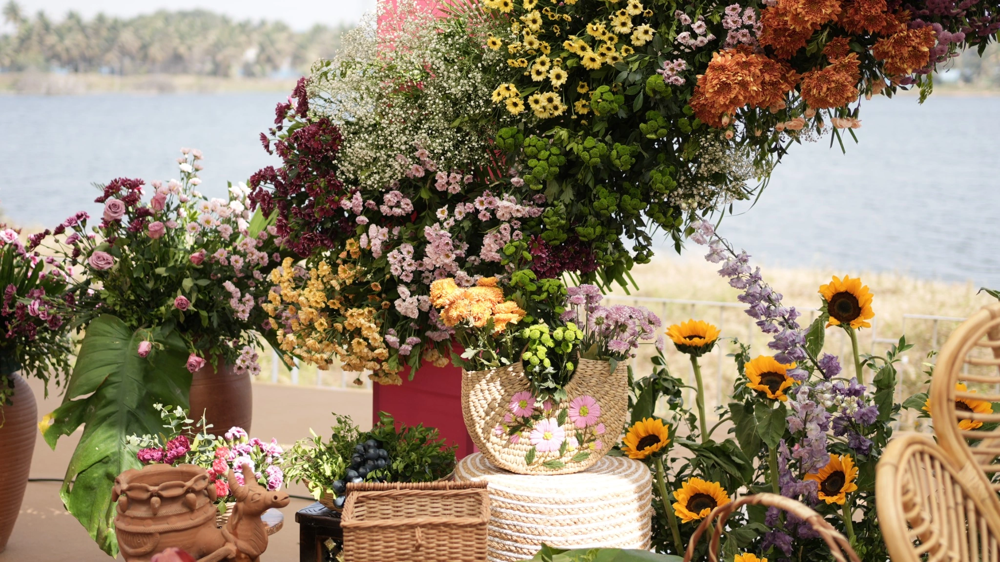
Wedding Colour Palettes for Bangalore Weddings in
2026
Some wedding colour combinations work beautifully because they balance tradition, contemporary styling and the natural surroundings of the venue. For Bangalore weddings in 2026, couples can explore terracotta and antique gold, dusty rose and ivory, sage and champagne, marigold and burgundy, navy and gold, and rust and copper.
Traditional red, green and gold remain timeless choices for couples who want their celebration to reflect Indian wedding customs.
The best wedding colour palette is not necessarily the trendiest one. It is the combination that complements your venue, suits your attire, works with your lighting and creates the atmosphere you want for your wedding.
Whether you are planning an elegant celebration at The Leela Palace Bengaluru, a garden-inspired wedding at Taj West End Bengaluru, or an outdoor celebration at The Lily Pond or The Lily Cascade, your colour palette can help bring every visual element together.
This guide explores six wedding colour palettes, styling ideas for different venues and practical tips for creating a cohesive wedding aesthetic.
Why Your Wedding Colour Palette Is an Important
Early Decision
Many couples choose their wedding venue first and think about decor colours later. However, the two decisions work best when considered together.
Your venue has existing colours, architectural details, lighting conditions and surroundings that influence how your decor will look. A palette that works beautifully in a garden may need adjustments for an indoor ballroom or a venue with darker flooring and warmer finishes.
Your colour choices also influence floral selection, fabric requirements, stage design, table settings and photography.
Here are five factors to consider before finalising your palette.
1. Venue and surroundings: Look at the existing greenery, flooring, walls, furniture and natural light. Your decor should complement these elements rather than compete with them.
2. Wedding attire: Consider the bride’s and groom’s outfits alongside the decor. Coordinated colours create beautiful photographs without making the entire celebration look too uniform.
3. Flowers and materials: Flower varieties, seasonal availability, fabric choices and metallic finishes affect how the palette can be executed.
4. Lighting and photography: Colours can look different in daylight, at sunset and under artificial lighting. Test important colours under conditions similar to your event.
5. Decor budget: Complex floral installations, customised structures and specialised materials can increase costs. A carefully planned palette can create a premium look without requiring elaborate decor everywhere.
At Dreamstrokes, we recommend discussing your colour palette early in the planning process, alongside your venue selection and decor brief.
6 Wedding Colour Palettes to Consider in 2026
1. Terracotta and Antique Gold
Terracotta and antique gold create a warm, earthy aesthetic that blends traditional Indian wedding elements with contemporary styling. The muted orange-brown tones of terracotta work particularly well with natural textures, while antique gold adds richness without appearing overly shiny.
How to style it
Use terracotta-toned drapes, antique gold accents, marigold arrangements, coral roses and textured fabrics. Ivory flowers can soften the palette, while warm lighting brings out its depth during evening functions.
Best suited for: Outdoor ceremonies, traditional weddings with a contemporary touch, sunset celebrations and intimate receptions.
Venue inspiration: The landscaped garden setting at Taj West End Bengaluru can inspire earthy, nature-led wedding styling. At The Lily Pond, terracotta and antique gold can complement the outdoor surroundings, particularly when paired with floral mandap decor and natural-toned fabrics.
For a more dramatic interpretation, the same palette can be carried into an evening celebration at The Lily Cascade using deeper terracotta tones and carefully placed gold accents.
2. Dusty Rose and Ivory
Dusty rose and ivory offer a romantic and elegant aesthetic. Unlike brighter pinks, dusty rose has a muted quality that pairs beautifully with soft fabrics, delicate florals and understated metallic details.
The combination can work across different wedding functions, from a daytime ceremony to an evening reception.
How to style it
Combine dusty rose drapes with ivory floral arrangements, blush roses, subtle gold accents and warm lighting. Keep the stage design balanced so the flowers and fabrics remain the focus.
Best suited for: Engagements, romantic garden weddings, daytime ceremonies and elegant receptions.
Venue inspiration: The refined interiors and grand architectural character of The Leela Palace Bengaluru can inspire a luxurious dusty rose and ivory wedding concept.
At The Lily Cascade, this palette can be adapted for the outdoor lawn ceremony and indoor hall reception. Coordinating the floral arrangements and fabric tones across both spaces can help the entire celebration feel cohesive.
At The Lily Pond, softer blush flowers and ivory elements can create an elegant garden-inspired look.
3. Sage Green and Champagne
Sage green and champagne are ideal for couples who prefer contemporary elegance over heavily saturated colours. Sage introduces a natural, muted green, while champagne adds warmth through fabrics, metallic accents and floral arrangements.
This palette can look especially harmonious in outdoor settings, where the colours complement the surrounding greenery.
How to style it
Use sage drapes, ivory flowers, champagne-toned fabrics, natural foliage and warm white lighting. Small gold details can add richness without overpowering the design.
Best suited for: Garden weddings, minimalist ceremonies, daytime celebrations and contemporary receptions.
Venue inspiration: The landscaped grounds of Taj West End Bengaluru offer inspiration for a nature-led sage and champagne concept.
For couples considering The Lily Pond, sage and champagne can complement an outdoor ceremony with floral arrangements that blend naturally with the landscape.
At The Lily Cascade, the same palette can connect the lawn ceremony, indoor hall and dining areas through coordinated fabrics, flowers and table details.
One important consideration is lighting. Sage can appear dull under poorly balanced lighting, so warm, well-distributed illumination can help preserve the intended look.
4. Marigold and Burgundy
Marigold and burgundy combine the festive energy of traditional Indian wedding colours with the depth of a rich, contemporary palette.
Marigold brings brightness and cultural familiarity, while burgundy adds contrast and sophistication. Together, they can create a striking design for both traditional ceremonies and evening celebrations.
How to style it
Use marigold garlands, burgundy fabrics, deep red floral arrangements and warm amber lighting. For daytime functions, allow marigold and lighter tones to dominate. For evening receptions, introduce more burgundy and antique gold.
Best suited for: Haldi celebrations, mehendi, traditional wedding ceremonies and evening receptions.
Venue inspiration: At The Lily Pond, marigold and burgundy can create a vibrant outdoor ceremony with colourful floral arrangements.
For couples planning a celebration at The Lily Cascade, the palette can transition from a traditional lawn ceremony to a richer indoor reception using deeper burgundy accents and warm lighting.
This combination is particularly useful when couples want traditional colours without relying exclusively on bright red and yellow.
5. Navy Blue and Gold
Navy blue and gold remain classic choices for couples who want a formal, sophisticated wedding aesthetic. Navy provides depth, while gold introduces contrast and highlights important design elements.
The combination can create a dramatic atmosphere for evening functions, particularly when the lighting and decor are carefully balanced.
How to style it
Pair navy backdrops with gold detailing, ivory flowers, elegant stage lighting and coordinated table arrangements. Use navy strategically instead of covering every surface in a dark colour.
Best suited for: Evening receptions, formal wedding celebrations and indoor functions.
Venue inspiration: The grand interiors of The Leela Palace Bengaluru can inspire a regal navy-and-gold wedding aesthetic.
At The Lily Cascade, this palette can be adapted for the indoor hall using navy stage elements, gold detailing and ivory flowers. The final design should take into account the hall’s dimensions, existing finishes and lighting arrangements.
For an outdoor reception, navy can be balanced with lighter fabrics and floral elements so that the decor does not feel too heavy.
6. Rust and Copper
Rust and copper create a rich, warm palette for couples who want something distinctive without moving too far from earthy wedding colours.
The combination works well with textured fabrics, natural floral arrangements, dried botanical details and ambient lighting.
How to style it
Introduce rust-coloured drapes, copper accents, peach or burnt-orange flowers and understated metallic details. Cream, beige and muted green elements can balance the deeper tones.
Best suited for: Sunset ceremonies, outdoor receptions, intimate celebrations and contemporary Indian weddings.
Venue inspiration: The garden atmosphere at Taj West End Bengaluru can inspire a natural rust-and-copper decor concept.
At The Lily Pond, the palette can complement an outdoor ceremony with warm floral installations. At The Lily Cascade, it can be adapted across the lawn and indoor hall for a consistent look throughout the celebration.
Rust and copper are particularly effective when paired with warm lighting, but lighter ivory elements can help preserve contrast in photographs.
Wedding Colour Palettes at a Glance
Terracotta + Antique Gold: Earthy, warm and contemporary.
Sage Green + Champagne: Fresh, natural and understated.
Navy Blue + Gold: Formal, dramatic and
timeless.
Dusty Rose + Ivory: Romantic, soft and
elegant.
Marigold + Burgundy: Festive, traditional and
rich.
Rust + Copper: Warm, distinctive and suited to sunset celebrations.
Each combination can be adapted to your wedding traditions, venue, attire and decor budget. Treat these palettes as starting points rather than strict rules.
Traditional South Indian Wedding Colours: A Timeless
Choice
Red, green and gold continue to hold a special place in South Indian weddings. These colours connect wedding decor with traditional attire, ceremonial elements, floral arrangements and the festive atmosphere of the celebration.
A traditional palette does not have to look dated. The result depends on how the colours are balanced, the quality of the materials, the freshness of the flowers and the precision of the styling.
For a contemporary interpretation, couples can introduce deeper greens, muted reds, antique gold finishes and more restrained floral arrangements.
For example, a traditional red and gold mandap can be paired with ivory flowers and subtle green foliage. Similarly, marigold can be combined with burgundy instead of bright red for a richer evening aesthetic.
At Dreamstrokes, the aim is to bring traditional elements and modern styling together in a way that reflects each couple’s preferences.
How to Choose a Wedding Colour Palette Based on
Your Venue
Your wedding venue should be part of the colour decision from the beginning. Existing architecture, landscaping, floor finishes and lighting all influence how decor looks in person and in photographs.
Grand Hotel Wedding Venues
For couples exploring luxury hotel weddings, venues such as The Leela Palace Bengaluru can inspire formal palettes such as navy and gold, dusty rose and ivory, or champagne and gold.
When choosing colours for a grand indoor setting, consider the existing finishes, ceiling height, lighting and scale of the decor. The palette should enhance the venue rather than compete with its architecture.
Garden Wedding Venues
Garden settings often work well with sage and champagne, terracotta and antique gold, dusty rose and ivory, and other earthy combinations.
The natural surroundings provide a backdrop that can reduce the need for excessive decoration in every area.
At Taj West End Bengaluru, the garden setting can inspire floral-led wedding concepts and nature-inspired palettes.
For couples considering The Lily Pond, earthy tones and garden-inspired styling can complement the outdoor setting.
Wedding Venues With Indoor and Outdoor Spaces
If your celebration includes an outdoor ceremony and an indoor reception, select a palette that works in both environments.
At The Lily Cascade, couples can explore a consistent colour story across the outdoor lawn, indoor hall and dining spaces.
For example, sage and champagne can be used for the ceremony, while champagne, ivory and gold details continue into the reception. The individual spaces can have their own styling while retaining a visual connection.
The goal is not to make every space identical, but to ensure that all the functions feel like part of the same celebration.
How Wedding Lighting Changes Your Colour Palette
A colour palette can look different in daylight, at sunset and under artificial lighting. This is especially important for Bangalore weddings that move from daytime ceremonies to evening receptions.
Warm lighting can enrich terracotta, rust, marigold and gold. It can also make ivory and dusty rose feel softer and more romantic.
Sage, navy and champagne may need carefully balanced lighting to preserve their intended tones. Strong coloured lights can distort the appearance of fabrics and flowers.
Before finalising your decor, discuss lighting placement and colour temperature with your planning and production team. If possible, review fabric and floral samples under lighting similar to what will be used at your event.
This small step can help prevent unexpected differences between your decor references and the finished setup.
Creating a Consistent Palette Across Multiple Wedding Functions
Indian weddings often include several celebrations, such as haldi, mehendi, sangeet, the wedding ceremony and reception. Each function can have a distinct look without making the overall wedding feel disconnected.
One practical approach is to select a primary colour story for the wedding and introduce variations for individual functions.
For example:
Haldi: Marigold, yellow and ivory.
Wedding ceremony: Terracotta, red and antique gold.
Mehendi: Sage, green and soft pink.
Reception: Champagne, ivory and gold.
These are starting points rather than fixed rules. You can choose different palettes depending on your traditions, attire, venue and personal preferences.
For a multi-function wedding at The Lily Pond or The Lily Cascade, the colour story can be adapted to the spaces being used. A lighter palette may suit the daytime ceremony, while richer colours and more dramatic lighting can create a different atmosphere for the reception.
The key is to maintain a visual connection through recurring colours, complementary materials or consistent floral styling.
How Your Wedding Colour Palette Affects Decor
Costs
A beautiful wedding palette does not always require an elaborate decor budget. The final cost depends on the scale of the installation, floral quantities, material choices, custom fabrication, lighting and the number of functions being designed.
A few practical ways to plan effectively:
- Choose complementary colours: A focused palette can create a more cohesive look than using too many competing shades.
- Consider seasonal flowers: Suitable seasonal varieties can offer attractive alternatives to more expensive choices.
- Prioritise key areas: Focus your budget on the mandap, stage, entrance or main photography areas before adding smaller decorative details.
- Reuse suitable decor elements: Where practical, carry selected elements across different functions.
- Match the decor to the venue: The scale of the styling should complement the available space rather than fill every area.
Whether you are planning a grand hotel celebration or an outdoor wedding at The Lily Pond or The Lily Cascade, the decor concept should be developed around your guest count, event schedule, venue and budget.
Planning a Bangalore Wedding With Dreamstrokes
Your wedding colour palette is more than a collection of shades. It is the foundation for a celebration that reflects your personalities, traditions and vision.
At Dreamstrokes Wedding Planners, we help couples bring different elements of wedding planning together, from developing the decor concept to coordinating colours, florals, venue styling and the overall event experience.
Whether you are considering a grand celebration inspired by the elegance of The Leela Palace Bengaluru, a garden-inspired aesthetic like that of Taj West End Bengaluru, an outdoor celebration at The Lily Pond, or a wedding across the indoor and outdoor spaces at The Lily Cascade, the right palette can help bring your vision to life.
The most successful wedding designs are not simply copied from references. They are adapted to the couple, the venue, the season and the atmosphere they want to create.
Let’s Plan Your Wedding Story
Tell us about your preferred wedding style, guest count, date and budget.
Dreamstrokes can help you explore the planning and decor possibilities for
your celebration.
Frequently Asked Questions About Wedding Colour Palettes
What are the best wedding colour combinations for 2026 in Bangalore?
Popular wedding colour combinations to consider for Bangalore weddings in 2026 include terracotta and antique gold, dusty rose and ivory, sage and champagne, marigold and burgundy, navy and gold, and rust and copper. Choose a palette that complements your venue, wedding attire, floral arrangements and overall wedding theme.
How do I choose the right wedding colour palette?
Choose your wedding colour palette based on your venue, outfits, preferred theme, seasonal flowers and lighting. Consider how the colours will appear in photographs and coordinate them across your mandap, stage, floral arrangements, table settings and other decor elements.
Which colours work best for an outdoor wedding in Bangalore?
Sage green and champagne, terracotta and antique gold, dusty rose and ivory, and rust and copper are excellent options to consider for outdoor weddings in Bangalore. Greenery, natural lighting, the ceremony timing and the surrounding landscape can help determine the most suitable combination.
Which wedding colour palettes suit luxury hotel weddings in Bangalore?
Navy and gold, champagne and ivory, dusty rose and ivory, and sage and champagne can complement luxury hotel weddings. At venues such as The Leela Palace Bengaluru, consider palettes that work with the interiors and architectural details. For garden celebrations at Taj West End Bengaluru, nature-inspired colours can create a cohesive look.
Which wedding colour palettes work for The Lily Pond?
Terracotta and antique gold, sage and champagne, and rust and copper are colour combinations worth exploring for outdoor weddings at The Lily Pond in Balagere, East Bangalore. Coordinate the colours with the greenery, natural light, floral arrangements and overall decor concept.
Which colours are suitable for a wedding at The Lily Cascade?
Dusty rose and ivory, sage and champagne, navy and gold, and marigold and burgundy can be adapted for weddings at The Lily Cascade in Gonighattapura, Bangalore. Coordinate the palette across the outdoor lawn, indoor hall and dining areas to maintain a consistent look throughout your celebration.
Can I use different colour palettes for different wedding functions?
Yes. You can choose different wedding colour palettes for haldi, mehendi, the wedding ceremony and reception. Maintain a cohesive appearance by repeating complementary colours, floral styles, fabrics or decorative accents across the celebrations.
Does wedding decor colour selection affect the budget?
Yes. Your colour palette can influence decor costs through flower availability, fabric selection, lighting, customised installations and the overall scale of the decorations. Selecting suitable alternatives and prioritising key visual elements can help you achieve your preferred aesthetic within your wedding budget.
When should I finalise my wedding colour palette?
Finalise your wedding colour palette during the early planning stage, ideally after shortlisting your venue and discussing your decor requirements. This allows enough time to coordinate wedding attire, flowers, lighting, fabrics and other design elements before the final arrangements are confirmed.